- Published on
Adding Dark Mode
Adding dark mode with TailwindCSS and VueUse
Since this site was blindingly bright (as can be seen in the previous post), I decided that it was necessary to make a dark mode for it. Luckily, Tailwind CSS can be configured to use a dark mode very easily using the dark: modifier on any class.
VueUse is a Vue package full of helpful composables. The ones we will be taking a look at in this post are useDark and useToggle. These functions can be used in combination to create a very simple darktoggle. useDark itself is actually a combination of the usePreferredDark and useStorage composables. This means that if the user decides that even though they might have light mode selected on their system, they can choose dark mode and it will persist using localstorage!
So to get started I added a new component called DarkToggle.vue to the navbar.
<script setup>
  import { useDark, useToggle } from "@vueuse/core";

  const isDark = useDark();
  const toggleDark = useToggle(isDark);
</script>

<template>
  <button
    @click="toggleDark()"
    aria-label="Toggle Dark Mode"
    title="Toggle Dark Mode"
  >
    <Icon
      :icon="isDark ? 'mdi:brightness-7' : 'mdi:moon-waning-crescent'"
      class="inline text-2xl ml-1 -rotate-45"
    />
  </button>
</template>
useDark will add/remove the class dark to the root html element, the darkMode attribute in tailwind.config.js had to be changed to class.
module.exports = {
  darkMode: "class",
};
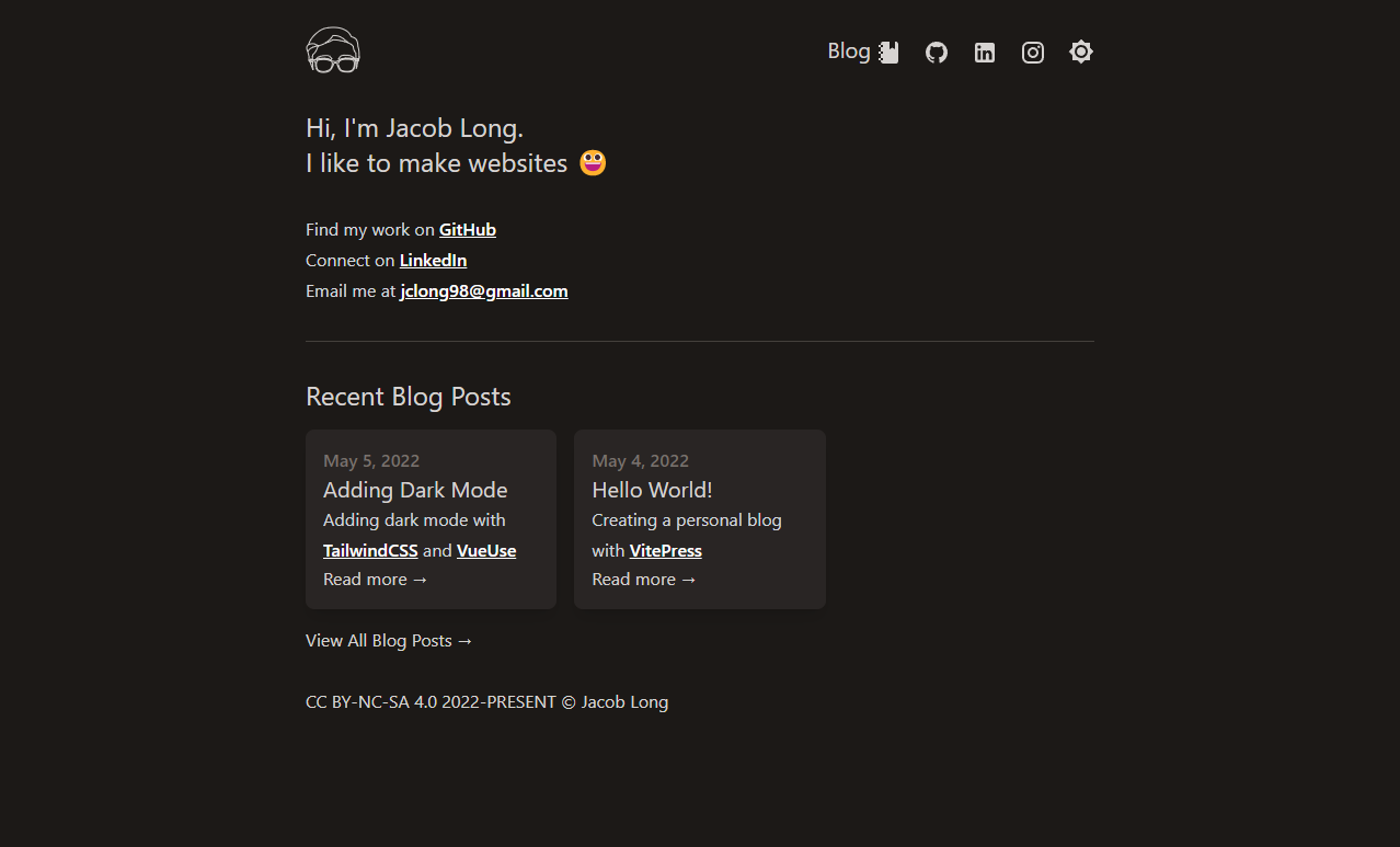
If the look of the site ever changes, here's what it looks like right now:
